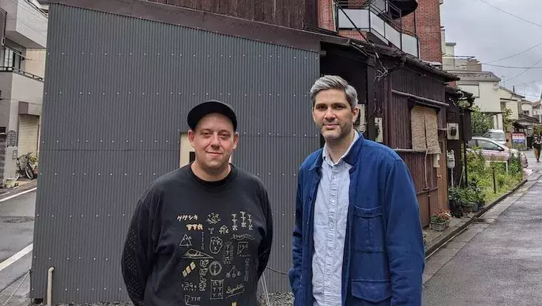
Ian Lynam and W. David Marx are long-time friends and collaborators based in Tokyo. In their individual careers, they’ve juggled many creative pursuits: Lynam runs a busy graphic design studio and teaches and writes widely on art and design; Marx wrote the 2015 book Ametora exploring how Japanese designers and entrepreneurs adapted, transformed, and then re-exported classic “American” style. But they’ve also continued a decade-plus partnership on the journal Néojaponisme, originally founded in 2007 as a vibrantly-designed blog covering niche topics in Japanese art, design, and history, and recently re-launched as an occasional print journal. Supported by a Kickstarter that quickly sold out, the first Néojaponisme print issue (abbreviated NJP #1) is focused on Shōwa Tokyo, the period of Japanese history that spanned 1926-1989. It features a guide to surviving Shōwa-era cafés, bars, and hotels, translations of little-known urban tales by icons like Junichirō Tanizaki and Yasujirō Ozu, a treasure trove of 1920s and 30s shopfront typography, a primer on visual symbolism of the 1960s student protest movement, and other topics examined with depth, wit, and Néojaponisme’s signature graphic style.
In a conversation with JAPAN HOUSE Los Angeles, Lynam and Marx share how they began exploring Japan’s design history, why Shōwa is such a fascinating era to uncover, and their hopes for more cultural and design preservation in Tokyo and beyond.
This interview has been edited and condensed for length.

For each of you, what first sparked your interest and journey in Japanese design history?
Ian: I moved to Japan after finishing grad school at CalArts and the design history classes that I took both in undergrad and grad school didn’t cover Japanese design history at all. Tadanori Yokoo got mentioned, but that was about it. [To learn more about the iconic Japanese artist Tadanori Yokoo, read an article about one of his latest projects] After moving to Tokyo, I was just insanely curious about why things look the way they do and why things looked the way they did historically. I’d visited Japan a few times in the 90s and it left a huge impression.
David: I came to Japan in high school, and since I studied Japanese language and society in college, I came during two summer breaks. I was much more into music and indie film than anything graphical, but while interning at a Japanese magazine in 1998, I discovered the cult around the street fashion brand A Bathing Ape and became very interested in why kids were willing to wait three hours in line to buy a single T-shirt. I do love Japanese design, but my interest has always been a bit more sociological: the origin of certain design conventions and how they’re consumed.
Néojaponisme was originally founded as a web journal in 2007 - what was the original mission, and how did it evolve online in the early years?
David: From around 2004, I had a blog called Néomarxisme, mostly about Japanese pop culture, and I wanted to expand the platform out to other writers and artists. I always loved two-color 1920s European art journals like De Stijl and Dada, and I liked the idea of making a new one for contemporary times, which I felt in 2007 meant a blog. I knew Ian was an expert in modernist design and interested in similar Japanese topics, and so he seemed like a great partner on the project. We basically never had any ads on the site and took in only the odd revenue from side projects, and we relied on the unbelievable graciousness of other writers. It was a great platform for Ian and I to write the most niche topics — things I wouldn’t even think to pitch anywhere else, like essays on pre-war Japanese fashion writers.
How did you decide to revive the project as a print journal in 2019/2020?
David: My dream was always to do a print journal, and after I realized the difference between doing a book and some blog posts, I wanted to channel the Néojaponisme energy into something print. I actually don’t remember where the idea came from, but at some point, I decided I wanted to make a faux travel guide to Tokyo’s old-timey Shōwa era spots. I used to love Tokyo for its new-ness, but after traveling around and seeing how much everything “new” is the same globally now, I got very excited about what makes Tokyo unique, and that’s more old than new.

What inspired the focus on Shōwa era (1926-1989) Tokyo? How did you approach trying to find traces of the earliest decades (ie pre-WWII) that are still around?
David: “Shōwa” spans many decades, but it represents a certain era in Japanese history — the mass embrace of Western influence, the War, and then early economic success. I was mostly interested in the aesthetic side of this: the particular Shōwa era buildings, cafés, and restaurants still left in Japan. They have a certain look and feel, because no one makes anything new that looks similar. In the course of writing my book Ametora, I also discovered an entire lost world of dance halls and Marxist-singalong cafes that I wanted to write about. And I had a long backlog in my head of things that I wanted to write about, such as Jacques Derrida’s visit to Japan in the mid-1980s, where I think he was much more lucid about his ideas in having to discuss them with Japanese philosophers. I hoped the guide would give people a sense of where to still find some of that Shōwa feeling.
Ian: I am enamored with the aesthetics of graphic design, surface design, history, literature, and fashion of the late Taishō and early- to mid-Shōwa eras—basically design before photographic-based typesetting came into play. I am interested in all of it for the ingenuity that people exercised in creating visual output before the relative ease of industrial reproduction. The financial rewards were so slim, yet the labor put into everything was just so exacting. Plus it was a time of great exploration in regard to visual culture. For the research, I have been slowly pecking away at a book of Japanese graphic design history from 1875 to 1975 over the past decade, and I am an avid collector of print ephemera, as well, so the resources are the things filling up the bookshelves behind me and the copious amount of Zoom classes, calls, and meetings I’ve participated in over the past year-plus. Folks just see shelves of plastic bags glinting in the background, but they’re the result of some pretty wide-ranging research trips all over Japan hunting down artifacts and ephemera, both lauded and vernacular in origin.
For David - much of your work like the book Ametora focuses on the fascinating ways that foreign styles (in clothing and beyond) have been embraced, transformed, and re-exported by Japan, particularly after WWII. Do you see that theme playing out in the earlier Shōwa era as well?
David: Many traditionally Japanese things happened in the Shōwa era but I didn’t cover them. What I particularly like about the Shōwa era is that the Japanese embrace of Western influence isn’t quite right, and these “mistakes” result in a distinct hybrid. The kissaten is a café, yes, but it's distinct in its particular menu of siphon coffee and thick “butter toast.” [To learn more about Japan’s unique kissaten cafés and the evolution of coffee culture, read more in “For The Love of Coffee”.] The kanban kenchiku “billboard architecture” style was kitsch at the time, but quite interesting now in retrospect.
For Ian - can you describe the distinctive red-and-white palette of the print journal, and how it continues the identity of the website with a particularly “Shōwa” twist? What were some influences on the design and layout of this print edition?
Ian: David and I hit on red, black and white early on (though néojaponisme.com 1.0 had no white, but instead an aged, yellowed paper texture in lieu of the white) as being reflective of Avant Garde journals that were popular in the early 20th century globally.
The cover is inspired by Kōshirō Onchi's book Hikō Kannō 飛行官能, or Sense of Flight, an incredibly rare and beautiful book wherein the author/designer tries to convey the feeling of flying in an airplane for the first time and looking down on Tokyo using a mix of printmaking, collage, photography, and connotative typography in 1934. Beyond merely quoting a historic publication, I really wanted to communicate to an audience member who might be aware of the book our understanding of history and appreciation of history, not merely quoting things glibly like the work of Shepard Fairey or other people who use “postmodern” approaches to appropriation without fully appreciating the source material. The cover is a reference, not an act of hapless appropriation and was done so with bucketfuls of intention.
As for the interior, I wanted it to feel like something from that era, but without resorting to smearing fake historical aesthetics all over it. The display lettering used throughout is a mix of new work inspired by historical models, especially the rise of “zuan moji 図案文字”, or “designed characters, as featured in lettering manuals from the 1910s and 1920s, mixed with display typefaces inspired by the Shōwa period previously released by my type foundry Wordshape. I tried to make the whole thing feel kind of ‘horsey’—something I strive for in my publishing work—a “down-home” aesthetic that reflects the content and occasionally mirrors it but isn’t slavish to replicating period aesthetics. I also used a lot of dumb presets to hopefully show the intention of my approach, such as every single decorative rule that comes stock with InDesign—glimmers of anti-virtuosity in the kissaten or whatnot.

Is it still possible to find Shōwa era buildings, restaurants, etc. in Tokyo’s physical landscape? Over the course of the pandemic, has that gotten even harder? Are there more attempts to preserve these remnants?
David: We sold out of NJP #1 very quickly, but enough of the establishments in our Showa Guide closed to make me pause on an immediate reprint. Some things may open back up after the pandemic (in particular, I am very eager to see Suntory’s Eagle Lounge open back up in Shinjuku), but a lot is likely gone forever. There are only a few who see these places as national treasures. They’re just perceived as leftover relics of kitsch. But I do think a lot of young people are catching on to the appeal.
The irony is that as soon as we finished NJP #1, I went to Kobe, and realized that all of this Shōwa culture is so much more alive and well there than in Tokyo. Crisis averted. You just have to leave town.
Do you find that the type of “retro” experiences sought out by locals or domestic travelers within Japan are different than the ones sought out by foreign visitors? How so? For instance, there’s been a huge surge of Western interest in 1980s Japan and City Pop aesthetics - is that a focal point of nostalgia within Japan at all? Why or why not? What other eras seem to be particularly “trendy” for vintage-minded local people these days?
Ian: It definitely is a very big point of interest for a lot of folks, though I would argue that the whole Niagara Records scene that preceded the City Pop phenomenon has heaps more cultural traction at present, as well as historically, perhaps because the folks that find Happy End and Tin Pan Alley (and the resulting Yellow Magic Orchestra) to be nostalgic have thicker wallets due to being a bit older.
David: I knew City Pop as the post-Happy End music from Haruomi Hosono, but the strain popular outside of Japan is the later 1980s digital elevator music variety. The appeal is its total escape from today’s artistic conventions: a pure kitsch built from extremely dated sounds, an AOR boogie from an imaginary world.
What’s next for Néojaponisme print journal? Do you have a theme in mind for a next issue?
David: Hopefully a new book every year on similar topics. I don’t know if we’d do another journal, but I am hoping to revive and expand the Shōwa Guide. I’ve found 2-3x the number of spots just in the last two years.
Where do you go to find inspiration in your daily life?
Ian: I spend a lot of time riding my bike around Tokyo and poking my head in old book shops. My students at Temple University Japan and VCFA are constant sources of inspiration, as well.
David: I do 10-20km walks around Tokyo (weather permitting). I can go to the same area over and over, and just by taking one parallel street to what I normally take, discover hundreds of new things.


Artists Inspired by Shōwa

Rina Yoshioka Ecstatic Butter Chicken, 2016
Acrylic on kento paper board
If you’re interested to learn more about the Shōwa era as a source of inspiration for contemporary creators, don’t miss JAPAN HOUSE Los Angeles’ next exhibition, “WAVE: New Currents in Japanese Graphic Arts”, on display from September 16 - November 28, 2021. Rina Yoshioka, one of the featured artists, has often referenced the Shōwa period in her work, such as her painting “Ecstatic Butter Chicken” (2016) which blends nostalgia with a cheeky modern spin. Learn more and plan your visit here.