Even before the disruptions of the coronavirus pandemic, the Olympic Games originally set for Tokyo 2020 (now postponed to this summer), were shaping up to be historic. It’s the second time the summer games are coming to the city, commemorating the landmark year of 1964 when Tokyo was the first Asian city to host the Games. One of that year’s key legacies for the nation, and for the Games as a whole, was the introduction of innovative “pictograms” which are minimalist visual symbols representing not only individual sports but other wayfinding information. Here, we reflect on the design breakthrough that is being honored and updated this year for a whole new era.
The 1964 Olympics were considered important by Japan to showcase its recovery from the devastation of World War II, and to spotlight its place as a modern nation on the world stage. In preparation, the city of Tokyo was radically transformed – not only by the construction of sleekly-designed Olympic stadiums, but other changes to the urban landscape such as new hotels, leisure spaces, and expanded public transportation (including the shinkansen or bullet train, which began operation nine days before the games began). The country mobilized to welcome thousands of foreign guests from over 90 nations, and also established the groundwork for a lucrative jet-age tourist economy. But a daunting challenge was apparent: how could international travelers navigate this complex city without getting lost? It was clearly impossible to create signage in every language, so the solution was to be found through universally legible images, not text.
To lead this massive design project, the Olympic committee appointed respected design critic Masaru Katsumi who assembled an all-star team including Yoshiro Yamashita, Yusaku Kamekura, Hiromu Hara, Takashi Kono and Sori Yanagi. The design team created indelible imagery for everything from logos to posters, uniforms to medals. But, their most lasting contribution was the “pictograms”. Yoshiro Yamashita was lead designer on the initial set of 59 pictograms, which included 20 images for the different sports in Olympic competition, as well as an additional 39 for wayfinding information (i.e. symbols to help visitors find a telephone, a first-aid station, a bank, and restrooms.) The symbols were brilliant in their combination of visual dynamism and simplicity, with each image pared down to its essential elements but still full of expressive motion. The pictogram for “volleyball,” for example, is ultimately composed of a few bent lines and two circles, but with just a glance, anyone can perceive it’s a human form in motion, hitting a ball into the air.
Tokyo 2020 Olympic Pictograms Concept Video
Tokyo 2020 Paralympic Pictograms Concept Video
Design historians would later suggest that these pictograms were so effective because they drew on much older traditions of Japanese art like ukiyo-e that distilled three-dimensional action into flat, streamlined images that could be easily incised as lines on a wooden block. The design team leader Katsumi has also suggested that a major inspiration was traditional Japanese crest design.
But the genius of his team was to synthesize these indigenous influences with a thoroughly modern, minimalist sensibility – which would go on to inspire the design of signage in all the spaces of a globalizing world (such as airports, hotels, and business centers), as well as every Olympic Games to come.
The pictograms were such a blockbuster success that they became an official part of Olympic policy. Every four years, for both the winter and summer games, the hosting city creates a unique set of pictograms as part of its own visual identity system. Some years, the symbols hew quite closely to the Tokyo 1964 originals. But occasionally, city design teams decide to inject culturally relevant design traditions, such as the 1968 Mexico City graphics which were inspired by ancient Mayan stone-carved petroglyphs, and the 2000 Sydney games which incorporated iconography of the Australian boomerang.
When it was announced that the Olympics would return to Tokyo in 2020, the design team might have felt a hefty responsibility. How could they honor the legacy of the groundbreaking graphics of 1964 while still innovating for a new era? The answer came partly as a result of new technologies that allow for, quite literally, new dimensions to be explored.
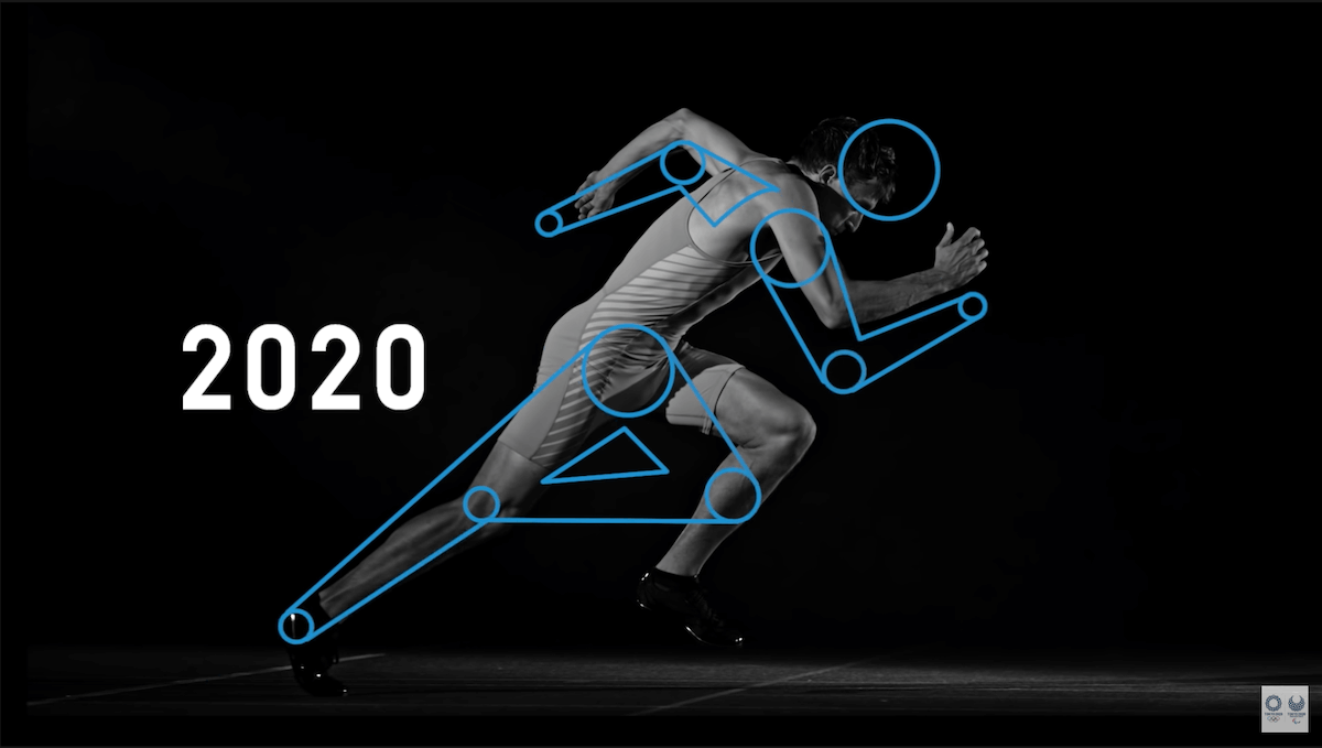
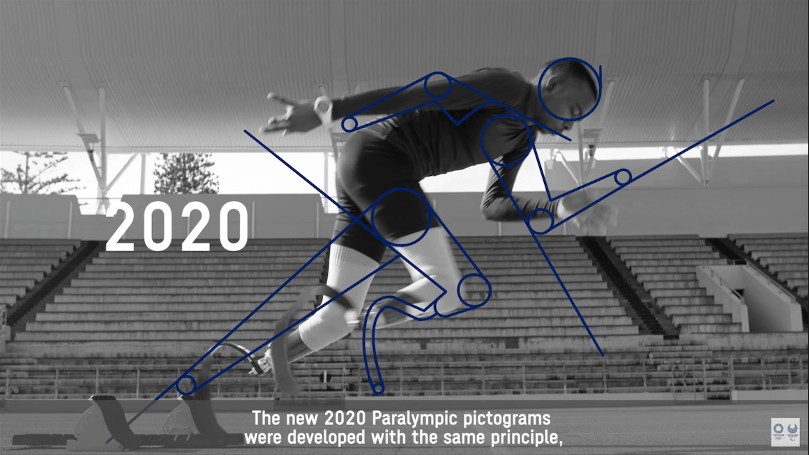
In March 2019, renowned graphic designer Masaaki Hiromura introduced the new set of 73 pictograms – more specifically, “kinetic icons” that were animated by Kota Iguchi representing 22 Paralympic and 33 Olympic sports (some sports have more than one pictogram). These pictograms are moving images, created not only for static signage, but for video billboards, broadcast TV, digital use on social media, and beyond. The set also includes designs for six new sports that were added to the summer games by the International Olympic Committee after years of lobbying by athletes and fans: surfing, sport climbing, skateboarding, baseball (men), softball (women), and karate (which might be considered another historic echo, as the 1964 Olympics were the first to feature the Japanese martial art of judo). In parallel, the Geospatial Information Authority of Japan (GSI) also released a new series of wayfinding map icons that they hope will be more legible to foreign visitors, not only during the Olympics, but for the growing number of international tourists that are projected to become a more important economic sector in coming decades.
While some of the new pictograms depart in form from their 1964 ancestors (such as “basketball” which now includes a hoop) they share the same style and spirit. As designer Hiromura has said, “we wanted a more modern design, incorporating athletes’ dynamism and trying to express their muscle movements, yet keeping it simple.” The animation quite literally brings these images to life, and carries with it the best of the Olympic spirit: helping people across the world connect, in creativity, unity and play. All elements that embody the essence of great global design as well.
Related Contents
Going for Gold | Japanese Olympic Design on the World Stage